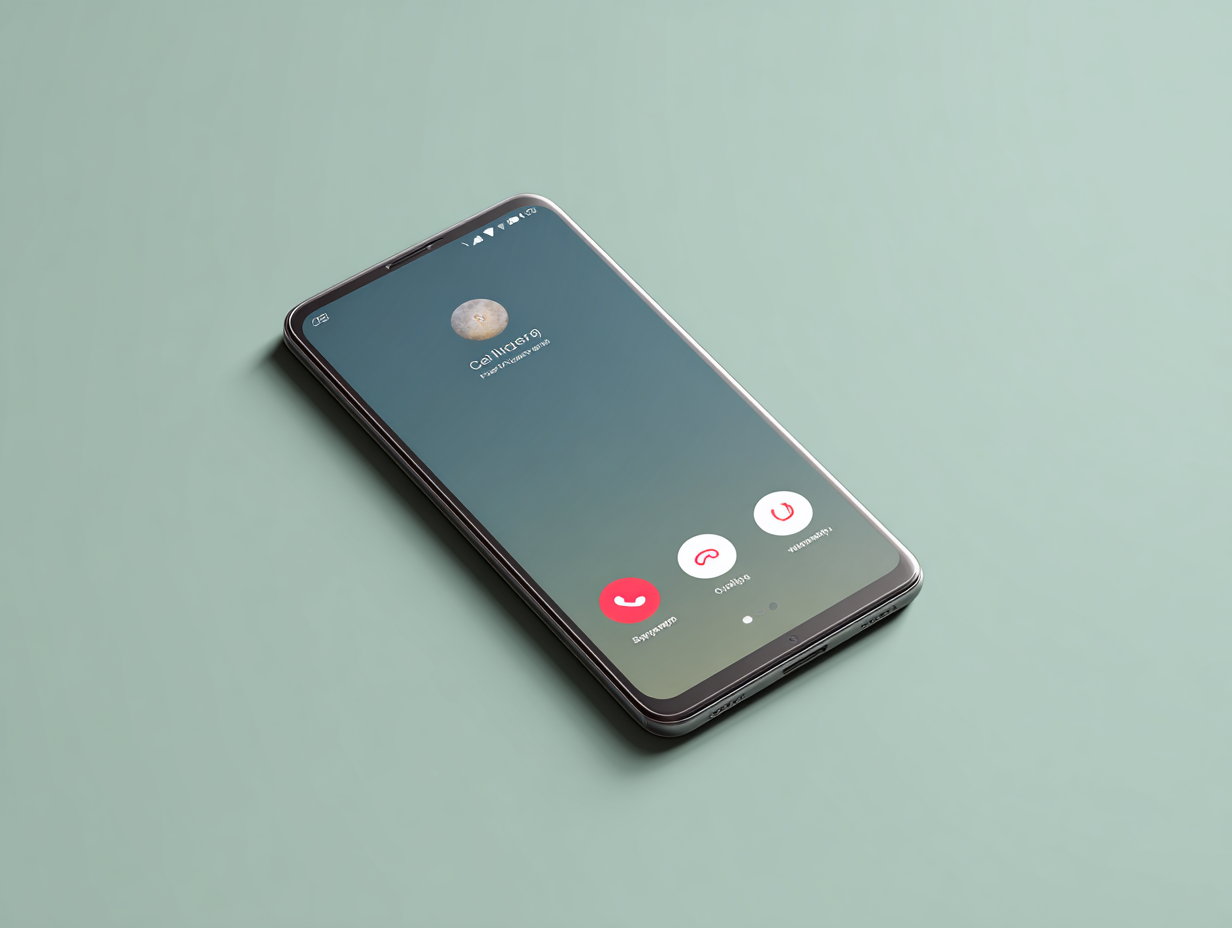
Many Android users have discovered that their calling screen has suddenly changed. This has also sparked a meme fest online. Here’s what’s happening.
If you’re an Android user in India and have noticed that your calling screen looks different, there’s no need to worry. This is due to a new user interface update from Google’s Phone app. The update incorporates Material 3 Expressive elements, giving the app a fresh look.
The new interface brings several changes to the app and calling screen:
- Contacts: Your favorite and recent contacts are now merged into a single tab. Favorite contacts appear in a carousel at the top, while recent conversations are placed in a container below. The keypad, previously a floating button, has been moved to a separate tab at the bottom. Contacts have also been moved to a new navigation bar at the top, and you can still access them from the three-dot menu.
- Incoming Calls: The incoming call screen has been updated to prevent accidental actions. To answer or decline a call, you now have to swipe horizontally instead of swiping vertically. This change aims to reduce accidental call answers or declines that often happen when taking your phone out of your pocket. You can change this setting back to a tap if you prefer.
- In-Call Buttons: The buttons on the call screen now have rounded corners, and the end-call button is larger for better visibility.
Google is also working on another update that will allow full-screen images to appear on the incoming call screen, though this feature is still in the testing phase. This feature is called contact card and is currently available for beta testers.
Meanwhile, Google is also rolling out a Material 3 Expressive redesign for the Android Clock app. The updated app will feature a taller bottom bar and a new, square floating button placed in a corner instead of the usual circular one in the center. Additionally, the new design will use different colors to highlight active alarms.


